Series 1: What Now? Wireframing & UI Dev - Part 2
Alright, picking up where we left off in the last post, it’s time to dive into the visual side of things. As I mentioned, the core of this project is building a tool to help streamline the penetration testing workflow, and that means designing an interface that’s both intuitive and efficient.
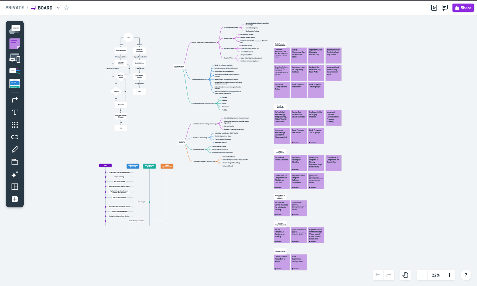
My first step was wireframing. I initially started with Balsamiq, thinking its simplicity would be a good fit. However, it quickly felt too simple for what I had in mind. I needed something with a bit more flexibility. So, I decided to switch gears and try a combination of Whimsical for the initial flowcharts and mind maps, and Figma for the actual UI design.
Mapping out the flowchart, mind map, sticky notes, and sequence diagrams in Whimsical has already made a huge difference. Having a clear visual representation of the application’s flow will make the design process much smoother.
With the flow mapped out, it was time to tackle the UI in Figma. Let me tell you, it’s a lot! I have a mental image of what I want, but translating that into a functional and visually appealing UI is proving to be a challenge.
Thankfully, YouTube is a lifesaver. After watching two insightful videos from the Juxopposed Channel, I felt ready to start putting pixels on the screen.
Eager for feedback, I shared my initial UI design on Reddit and reached out to fellow pentesters on LinkedIn. The initial responses have been encouraging and provided some valuable insights.
One Reddit user suggested: “Make the bold black text centered and the white boxes at the bottom make it larger so that they fill the gaps it will look better.” This is a great point about visual balance, and I’ll definitely be implementing that in the next iteration.
The feedback from LinkedIn was also positive. One connection mentioned, “The UI is clean, modern, and easy to follow.” It’s great to hear that the initial design is hitting the right notes in terms of usability.
Another insightful comment I received was: “I really like the focus on methodology, tool suggestions, and command prompts—super helpful for structured testing. Maybe consider adding a small interactive preview or visual workflow to show how users move through each phase. Overall, great concept—excited to see how it grows!” This is a fantastic idea about the interactive preview! As soon as I have the dashboard more functional, I’ll definitely explore how to integrate a visual workflow to further enhance user understanding.
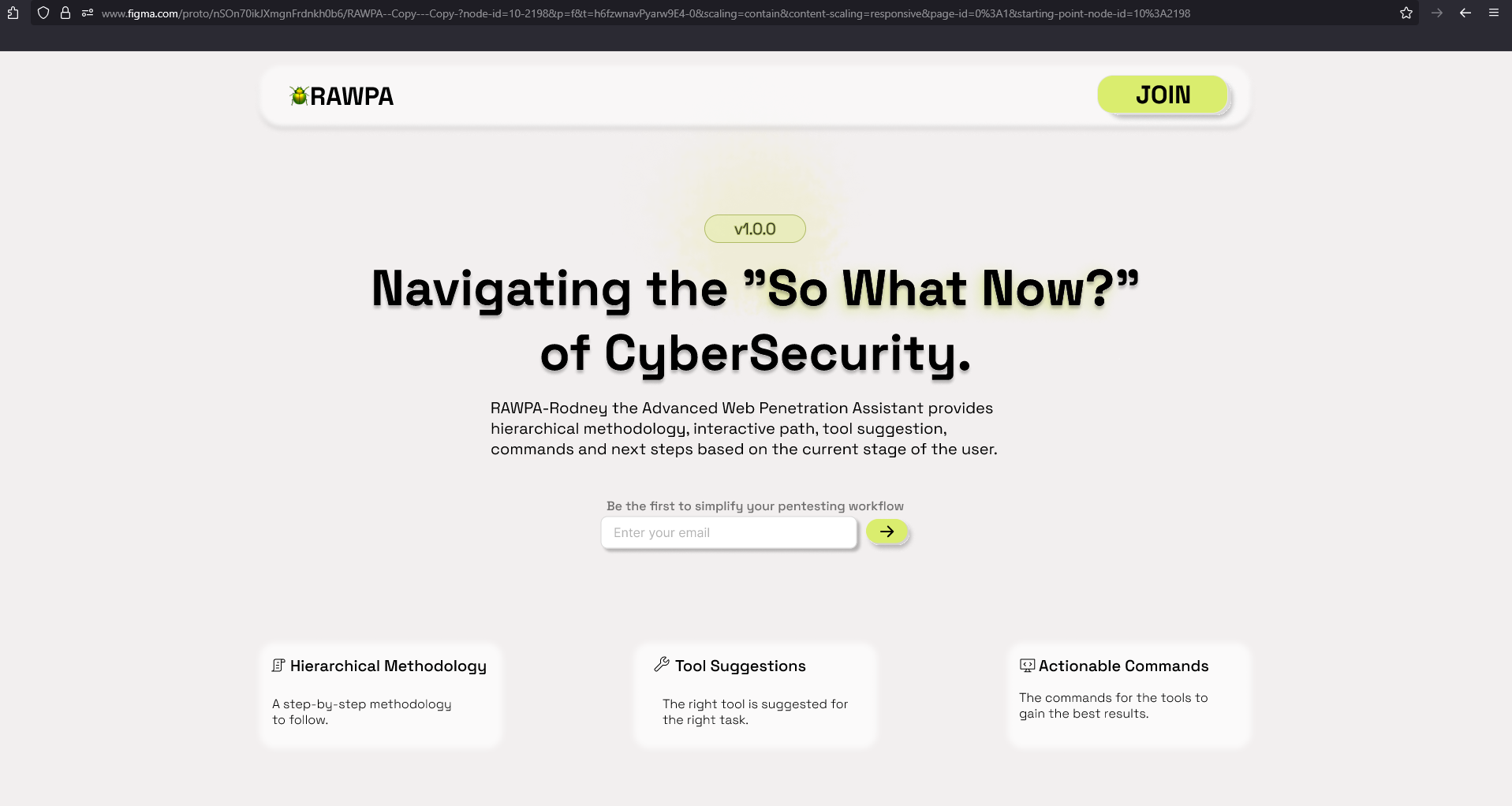
This is what the UI is now.
It’s incredibly helpful to get this early feedback, and it’s already shaping the direction of the UI development. Stay tuned for the next post, where I’ll hopefully have updates on implementing these suggestions and more progress to share!